 Skip to content
Picture this: You’ve worked with an agency to create a great brand with colors that stand out from the competition, your logo is eye catching, and you think your site will provide a smooth user experience for patients and providers…but there’s one complicating factor: risk information and how it’s represented.
In our FDA-regulated industry, there’s no getting rid of fair balance requirements. That said, each company’s interpretation of how to implement risk information is slightly different. We’ve worked with teams who want to push the envelope and minimize risk information visually, as well as teams who are more conservative and want to make sure risk information is proportional and prominent. At our agency, we call the risk information displayed on each page ISI, which stands for important safety information. On a website, ISI usually ends up being a bone of contention in terms of placement, sizing, functionality, and style.
Our last piece reviewed some exclusive data about how new molecules are being marketed vis-à-vis brand colors, dovetailing some of our other work on pharma branding and logo creation. This week we’ll discuss how new molecules that were approved in 2021 and are currently being marketed are treating IS on their websites.
How Drugs are Positioning ISI for Fair Balance
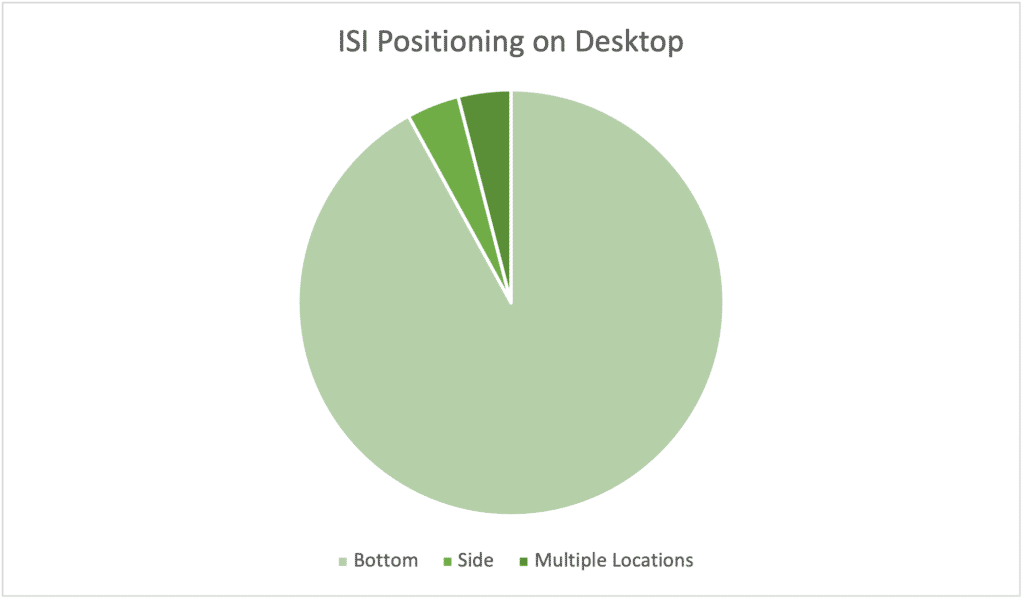
Takeaways: The industry’s position on desktop ISI positioning (sorry) strongly favors placing it on the bottom, with only two new drugs going for a side ISI, and two drugs using a mixed approach with both side and bottom ISI. Both pure side ISI pages place it on the right, but the mixed approaches differ with side ISI appearing on the left in one and on the right in another.
Proponents of side ISI note how bottom ISI disrupts desktop design, especially if it utilizes a third or more of the screen. With the addition of mandatory cookie messages or other horizontal features, real estate for your branding, messaging, and navigation can be super limited and impact usability. We’ve seen sites with less than half of available vertical space visible because of these restrictions.
Caveats: I didn’t show mobile because there’s only one viable path: putting it on the bottom. Potential advantages of side ISI disappear on mobile because it’s not compatible with a default narrow vertical orientation. When I discussed side ISI with our digital department head, he noted that users on desktop may become confused if there are multiple scroll bars right next to one another with right-side scrolling ISI. The difficulty of implementation, according to him, is no different between side or bottom on desktop, but if you’re thinking mobile-first, a side ISI is a no-go.
How Drugs are Treating ISI on Desktop
ISI treatment is more of a mixed bag and seems to be highly dependent on organizational risk tolerance. By treatment, I mean the way ISI is integrated into the UX. Does it expand? Does it collapse? Is it a single line or heading, or does the first chunk of indication and risk copy show? Here’s how 2021’s novel molecules are treating the question:
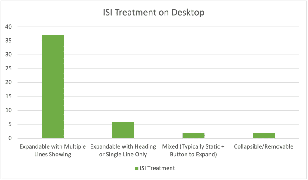
Takeaways: While the consensus treatment is overwhelmingly to display several lines or even the first paragraph of ISI (typically indication and most serious warnings) as a sticky feature on the page that expands, I saw more single-line or heavily abbreviated risk information than I expected. Even some of the multiple-line ISI treatments were heavily truncated, including those with black box warnings in the mix. It’s obvious marketers are feeling the impact of ISI on visual real estate and pushing for the least copy possible.
The vast majority favor an expandable ISI that toggles open and shut, but two have what I call a “collapsible” ISI that allows users to “x” out of the ISI and reduce it down to a single line to better see the page. That’s a happy medium for those who aren’t willing to take the risk of having a single line visible from by default but want to make sure interested users have the option to see more of the page. It still offers more risk than the always-showing approach.
In every case, the norm is to have ISI appear in full when scrolling to the bottom of the page.
If you’re wondering how best to incorporate risk information for a new pharmaceutical brand or thinking of restyling your drug’s website, we’d love to walk through your options. We can find a way to treat ISI that makes everyone happy—even regulatory!