Skip to content
Project Description
Our pharmaceutical advertising work for FeRiva.
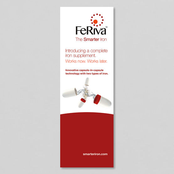
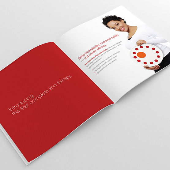
Sometimes the best way to capture a complex value proposition is through a descriptive visual, something we achieved with our FeRiva branding. With the dotted circle and solid circle representing the two different types of iron in the formulation, coupled with evocative red accents,
we were able to convey the product’s unique value proposition. A brochure for healthcare providers leveraged this visual device to explain the product’s pharmacokinetics, and our logo design incorporated it as well.